Saturday 20 March 2010

A little bit of Staycation...

After taking the images of the pier and the seaside at home I begun to experiment with drawing a few images and placing them on top of the images I had previously taken. I played around with the opacity on the image in the background to get it a little lighter and more transparent, and placed my linear drawings on top. I then found some existing text to place upon the image. I hand wrote it and scanned it in, as I think that my illustrations would look better with a hand drawn font.

These are my outcomes so far:

When thinking of ideas I did think about posters and printed them out onto a3 textured paper and it looked lovely. Although I liked them my idea isn't to promote or make a campaign on the seaside. My aim is to create a nostalgic piece that will jog peoples memories about the good times at the british seasides, and make them want to re-live this. This will be created in a postcard format with a small delicate handmade box to keep them in.


Dont Panic! :Resistance


This brief was a quick brief, a small bit of research, a little bit of brainstorming, ideas and then an outcome. Originally I had been looking at language, and then one day I got this sweet idea! I was sat looking at my previous idea thinking it wasn't good enough, as I was thinking this I had been bought a cupcake. Just as I was thinking I probably shouldn't eat this, I had the light bulb of all ideas! The idea of resistance being things that are bad for you, or naughty.

I then went about drawing some yummy cakes and food we associate to be lustful but naughty. The idea of wanting it, but feeling guilty if we have it. Resistance.

The drawings then got put into illustrator where I changed colours, positions and layouts. I then thought about scanning in my own hand writing and having a small slogan under each one, something we would think or say "naughty naughty" or something cute like "Hello there sweet..."

And these were my outcomes:


Although I wasn't that pleased about the way they had turned out, once printed onto A3 textured paper I found the images really did work and the colours and chosen images looked a lot better than on screen or normal a3 printer paper. Johnny Hardstaff really liked these pieces so maybe their not as bad as I thought?! After all it was a quick turn around brief!

Folio Review: Johnny Hardstaff

On thursday afternoon I was scheduled for a folio crit with Johnny Hardstaff. He was very friendly but professional in regard to how he went about giving us advice. He was very helpful and offered his service of critique and advice if ever I needed it in the future, telling me I could email him with ideas to see what he thought.

Although a few of my projects, he explained were a little unclear he explained himself to be "a sucker for the imagery" which was great, as creating imagery is what I would potentially like to do. I was also happy that he got excited by my resistance work, the brief I thought was the weakest. The crit was helpful and Johnny opened my eyes to a few things I need to be thinking about.

Alice in wonderland


Last night I went to watch Alice in wonderland in 3D, I wanted to see what all the hype was about as I absolutely love the old disney version. Although I really enjoyed the film I didn't particularly think that the 3d version was as amazing as everyone had said. I was surprised to find that the 3d effect was 3d into the film rather than it feeling it was coming towards me.

I really enjoyed watching the relationships develop between the characters and the special affects that was included in the film, including the queen of hearts large bulbous head!! I would recommend to watch the film but don't think its essential to watch it in 3d.


D&AD: Mothers day stall fundraiser


As a contribution to the D&AD degree fund myself, Leanne, Jemma with a J and Anna decided that a mothers day stall would be a good plan. As there had previously been a mothers day stall a few days before we decided to sell the remainder of their stuff as well as our own that we had made.

I had previously been drawing cakes for a brief, when I thought about a t-shirt my mum was given years ago, as part of a charity run for breast cancer, that said "I am a yummy mummy". I then thought that this could make something quite sweet.


I really enjoyed doing the stall, even though there was a mothers day stall right next to us made by the photography students! They were rude and unfortunately I don't think they did as well as we did! Oh well!

The grand total of our day in the holden gallery was £66.80p
Thank you to everyone who contributed with stuff to sell and all those who came down and bought stuff :)

Walls are talking

Renne Green: Commemorative toile 1992

A while ago I visited an exhibition at the Whitworth gallery, walls are talking. I found some of the wall paper designs to be very inspiring and visually exciting to look at, others I felt were slightly odd and could not even imagine them on the walls of anyones homes! The exhibition displayed work by over 30 artists, one of whom was Damien Hirst and Francesco Simeti. Rather than the stereotypical kitsch ideas about wallpaper, the artists have displayed messages on racism, gender and cultural conflicts upon the wallpapers. The exhibition was grouped around a few specific themes, sexuality, commodification, imprisonment and subversion.

Francesco Simeti: Arabian nights 2003

Although there were lots of different designs I enjoyed there were a couple that really stood out. I particularly enjoyed the work that was shown by Francesco Simeti and Renne Green. I thought both pieces were visually exciting and when looking closer at them they seemed to have been almost telling a story rather than just a pretty pattern. It was like having a piece of history or a novel shown on the wall paper.

I really enjoyed this exhibition and thought some of the wallpapers were really interesting and inspirational. Wallpaper was something I had never thought about designing or having a go at, maybe this could be brought into a future project?

Thursday 4 March 2010

Don't Vacate. Staycate!


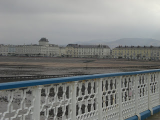
During the self directed week I decided to go home to take some more images of the lovely seaside. I also wanted to go out and sketch a few bits of the piers I had taken images of, as part of the experimental & development bit of the brief. I took the time to stroll down Llandudno pier, and although still a much visited place, it felt old and almost derelict.


I have never actually properly looked and taken things in, while walking down the pier. But everything seems the same, like its stuck in some sort of time zone! Nothing seems to have changed! The small huts along the pier selling welsh novelties, the amusements and games are still, but barley there! Even the old man selling country music on cassettes and cd's is still stood in the same hut just behind the bumpy slide ride!


I had a walk up and down the pier, taking in the scenery as well as taking images. Although I may not end up using the images, it was nice to take some time out and really get the feel for the seaside again ♥