Saturday 20 March 2010

A little bit of Staycation...

After taking the images of the pier and the seaside at home I begun to experiment with drawing a few images and placing them on top of the images I had previously taken. I played around with the opacity on the image in the background to get it a little lighter and more transparent, and placed my linear drawings on top. I then found some existing text to place upon the image. I hand wrote it and scanned it in, as I think that my illustrations would look better with a hand drawn font.

These are my outcomes so far:

When thinking of ideas I did think about posters and printed them out onto a3 textured paper and it looked lovely. Although I liked them my idea isn't to promote or make a campaign on the seaside. My aim is to create a nostalgic piece that will jog peoples memories about the good times at the british seasides, and make them want to re-live this. This will be created in a postcard format with a small delicate handmade box to keep them in.


Dont Panic! :Resistance


This brief was a quick brief, a small bit of research, a little bit of brainstorming, ideas and then an outcome. Originally I had been looking at language, and then one day I got this sweet idea! I was sat looking at my previous idea thinking it wasn't good enough, as I was thinking this I had been bought a cupcake. Just as I was thinking I probably shouldn't eat this, I had the light bulb of all ideas! The idea of resistance being things that are bad for you, or naughty.

I then went about drawing some yummy cakes and food we associate to be lustful but naughty. The idea of wanting it, but feeling guilty if we have it. Resistance.

The drawings then got put into illustrator where I changed colours, positions and layouts. I then thought about scanning in my own hand writing and having a small slogan under each one, something we would think or say "naughty naughty" or something cute like "Hello there sweet..."

And these were my outcomes:


Although I wasn't that pleased about the way they had turned out, once printed onto A3 textured paper I found the images really did work and the colours and chosen images looked a lot better than on screen or normal a3 printer paper. Johnny Hardstaff really liked these pieces so maybe their not as bad as I thought?! After all it was a quick turn around brief!

Folio Review: Johnny Hardstaff

On thursday afternoon I was scheduled for a folio crit with Johnny Hardstaff. He was very friendly but professional in regard to how he went about giving us advice. He was very helpful and offered his service of critique and advice if ever I needed it in the future, telling me I could email him with ideas to see what he thought.

Although a few of my projects, he explained were a little unclear he explained himself to be "a sucker for the imagery" which was great, as creating imagery is what I would potentially like to do. I was also happy that he got excited by my resistance work, the brief I thought was the weakest. The crit was helpful and Johnny opened my eyes to a few things I need to be thinking about.

Alice in wonderland


Last night I went to watch Alice in wonderland in 3D, I wanted to see what all the hype was about as I absolutely love the old disney version. Although I really enjoyed the film I didn't particularly think that the 3d version was as amazing as everyone had said. I was surprised to find that the 3d effect was 3d into the film rather than it feeling it was coming towards me.

I really enjoyed watching the relationships develop between the characters and the special affects that was included in the film, including the queen of hearts large bulbous head!! I would recommend to watch the film but don't think its essential to watch it in 3d.


D&AD: Mothers day stall fundraiser


As a contribution to the D&AD degree fund myself, Leanne, Jemma with a J and Anna decided that a mothers day stall would be a good plan. As there had previously been a mothers day stall a few days before we decided to sell the remainder of their stuff as well as our own that we had made.

I had previously been drawing cakes for a brief, when I thought about a t-shirt my mum was given years ago, as part of a charity run for breast cancer, that said "I am a yummy mummy". I then thought that this could make something quite sweet.


I really enjoyed doing the stall, even though there was a mothers day stall right next to us made by the photography students! They were rude and unfortunately I don't think they did as well as we did! Oh well!

The grand total of our day in the holden gallery was £66.80p
Thank you to everyone who contributed with stuff to sell and all those who came down and bought stuff :)

Walls are talking

Renne Green: Commemorative toile 1992

A while ago I visited an exhibition at the Whitworth gallery, walls are talking. I found some of the wall paper designs to be very inspiring and visually exciting to look at, others I felt were slightly odd and could not even imagine them on the walls of anyones homes! The exhibition displayed work by over 30 artists, one of whom was Damien Hirst and Francesco Simeti. Rather than the stereotypical kitsch ideas about wallpaper, the artists have displayed messages on racism, gender and cultural conflicts upon the wallpapers. The exhibition was grouped around a few specific themes, sexuality, commodification, imprisonment and subversion.

Francesco Simeti: Arabian nights 2003

Although there were lots of different designs I enjoyed there were a couple that really stood out. I particularly enjoyed the work that was shown by Francesco Simeti and Renne Green. I thought both pieces were visually exciting and when looking closer at them they seemed to have been almost telling a story rather than just a pretty pattern. It was like having a piece of history or a novel shown on the wall paper.

I really enjoyed this exhibition and thought some of the wallpapers were really interesting and inspirational. Wallpaper was something I had never thought about designing or having a go at, maybe this could be brought into a future project?

Thursday 4 March 2010

Don't Vacate. Staycate!


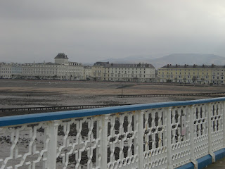
During the self directed week I decided to go home to take some more images of the lovely seaside. I also wanted to go out and sketch a few bits of the piers I had taken images of, as part of the experimental & development bit of the brief. I took the time to stroll down Llandudno pier, and although still a much visited place, it felt old and almost derelict.


I have never actually properly looked and taken things in, while walking down the pier. But everything seems the same, like its stuck in some sort of time zone! Nothing seems to have changed! The small huts along the pier selling welsh novelties, the amusements and games are still, but barley there! Even the old man selling country music on cassettes and cd's is still stood in the same hut just behind the bumpy slide ride!


I had a walk up and down the pier, taking in the scenery as well as taking images. Although I may not end up using the images, it was nice to take some time out and really get the feel for the seaside again ♥

Dear Mr. Postman...

Last week Leanne and I decided that talking to a postman would be the next best step to take to enable the brief to move forward successfully and would contribute well to the research side of the brief. We got wind that a few postmen drink after their shifts on a friday in weatherspoon in Fallowfield. So we went! As we waited none were to be seen, we had to re think our plans! We then thought about going into the sorting office to ask them for 5 minutes of their time, but yet again it wasn't possible, the queue was out the door!

We then thought about sending them mail. The idea being, we post a letter through the everyday post boxes around streets, and address them to the postmen. Inside is a piece of paper with the questions and brief description about what and why we are doing this. There was also a ready addressed and stamped envelope inside the letter so that they could send them back to us if they wished to fill them out. We each sent 6, Leanne dispatched in Manchester and myself in North Wales.

Yesterday morning I received a reply from a kind postman in Chester. His response was very useful and I'm very happy we have had a response!

Let's hope there are more caring and willing postmen out there!

Get posting!

Sunday 21 February 2010

Urbis: Home-grown: the story of UK hip hop.


Yesterday I visited the Urbis for one last time!... I cannot believe its being made into a football museum?what a waste! For one of the final exhibitions shown in the Urbis I was very pleased to see that it was quite and interesting and educational one. When I first heard about the exhibition I thought to myself, hmm hip hop? This wont be totally up my street at all! But I was pleasantly surprised! I really enjoyed walking around learning as I was looking at the art and culture of the UK hip hop scene leading up until today.

The exhibition looked back over almost 3 decades and shows how the spirit of the Bronx block party and an individual british influence was taken upon by a generation of young youth. In doing so it shows how a US subculture featuring art, politics, rhyme, dance and music was adopted, adapted and embraced to create a powerful, complex, cultural force, this side of the Atlantic. The exhibition brings together the rare and remarkable hip hop photography, music, film and fashion from the best private collections.


I particularly liked and looked more closely at the music, the album/ vinyls and cassette designs as I find these elements interesting and visually exciting! I was also very interested in the print documents that were created and designed for the UK kip hop scene.


I was glad that i'd decided to go to urbis as I wasn't intending on going to this exhibition, but as I realised it would be one of the final times I thought I'd regret not going. I actually really enjoyed this exhibition and feel the need to tell people that are not aware that it's there to go and have a look. People who are involved in design obviously hear about these exhibitions all the time, but what about those people who are still involved in this culture, dress, listen to the music, are not aware? Spread the word!

Max Ernst: une semaine de bonte


A while ago while looking for books I came across a book that I'd previously sat and studied in the Whitworth gallery. It was Max Ernst's 'Une Semaine de bonte', a lovely book full of Ernst's black and white works, in my opinion the most successful work he has done.

I like so many aspects of Ernst's work, the early collage feel to it, the surrealism he captures in the images, and also the gothic, strangely eerie feel they have to them. I also particularly like the fact they are so simple in colour, I feel that sometimes black and white images can be more striking and effective than colourful, in your face images.


This book is one of the most interesting books I have read and seen. Although I am interested in contemporary art and design I am fascinated with the older art and the type of work that has a lot of history behind it. The images are beautiful although slightly odd most of the time! I found that looking at an Ernst piece, isn't easy to take it all in and notice everything at once, every time you look back at an image you will see something you hadn't before. Are there hidden meanings behind these images?

Stop oh yes,wait a minute mr. postman...

Headline: "Postman Pat loses all his rubber goods" - Royal Mail.

Recently Leanne and I decided to attempt the elastic band brief as a project on the side. The brief being :

"Create a campaign to encourage postmen to stop dropping elastic bands in the streets. Use any appropriate media."

We have been researching this subject, and I personally wasn't aware at how big of deal dropping elastic bands were to the public. The are endless articles about how much the royal mail spend on elastic bands every year (£1 million), and how radio stations asked viewers to send in elastic bands they found, so they could send them back to the sorting office. There were even articles about the red rubber bands harming animals.

We recently set out to ask a handful of postmen a few questions on this subject as we were aware they drink weekly at a local bar, typically for us they weren't there when we got there. We waited but it seems they were otherwise engaged!

The brief is turning out to be something quite fun. Although we do want to take a rather serious approach we also want to have fun with it, while trying to get the point across.

Thursday 11 February 2010

RSA postage stamps


Last term one of the briefs I did was the RSA Postage stamp brief. Although I did enjoy this brief I thought it would be a little more simpler than it actually was. I was looking forward very much to start this brief, and couldn't believe how stuck I had got before finally getting an idea!

There were 2 choices, to look at biodiversity or celebrate the 4 countries. I instantly wanted to do the biodiversity but after much research realized that all my ideas and all that I would have liked to have done, had already been done. I then went about researching the 4 countries, this was also harder than expected. I was surprised at how horrible some of the stamps for this category were!


I then had a bright idea! (mind the pun). When thinking about biodiversity I was always thinking about the obvious, nature, animals and the environment. Then I started thinking about how we need to sustain a better way of live not only for the earth but for us as well. One of the biggest things that stood out was the co2 emissions, and our carbon footprint. This is where I got the idea of the energy saving life bulbs. I then drew some different light bulbs from angles and then played around with them on stamp templates.

I managed to turn this around in a few days, and to think I had no final idea I am very happy with the outcome. Although simple, I feel that stamps must be, as they are small and need to be eye catching. Although assessment has been I'd maybe like to try develop these stamps to see how they could progress.

It must be love...


Recently I spent the day making a set of valentines day cards to sell on the degree fundraiser stall in the holden gallery and union. I thought about what I could put on the front of the cards and the thought of making tacky "I love you" card with lots of kisses and hearts really didn't appeal to me!


While sat around my room looking for more less obvious things to put on the cards I remembered about the birds I'd drawn for my silence project. I then thought about the expression that people use when two people are in love " Love Birds" and put both these ideas into action.


I then thought about how I could present the cards, and that is when I found the small wooden pegs in my draw, and some lovely brown envelopes. I'm quite happy with the way the cards turned out, and really enjoyed making them. I think in the future I would like to have a go at making some more cards.

Wednesday 10 February 2010

Cube Gallery

Yesterday a few of us decided to visit the Cube gallery on our way into town, and quite frankly I was quite disappointed. I'd heard good reviews and people saying the exhibition was a must, when really I only found a handful of pieces in the exhibition to be of interest.

Maybe it wasn't totally my cup of tea and other people found it to be of help or interest, but some of the pieces were definitely not up my street! Although I am very open minded when it comes to design and I am always open to new ways of working and ideas, I think I have a specific type of interest. I particularly like handmade pieces, illustrated pieces, and almost old vintage looking pieces.


Although It wasn't to my expectations I did find a few pieces that I liked. This was particularly my favorite, "Victorian Gothic: The Dilemma of Style 1980 a lecture poster. I really liked the choice of pallet here, the navy blue and white linear illustration and handwriting really compliment one another. There is so much to look at in this lecture poster, so many small patterns and details within the image itself.


Another few pieces I thought fitted in well with the dissertation I had previously handed in was the typographic collages. I was looking at the cut and paste approach many visual artists and music artists had during the 70's. Below is an image of a glass case full of small pockets full of cut out letters. There's something really nice about these pieces, simple but really nice to look at.


I think these pieces of design work really well as a set and although different they all hold an element that connect them together. As well as working in a set I also think they work just as well individually. I particularly like that they are displayed in white photo frames and in all different sizes.

Although a few people agreed with me, that the exhibition wasn't as good as they had anticipated, I wonder weather I was in the right frame of mind when visiting cube? There was a few good pieces here, but I do think that it may have been suited to some people, while others maybe not so much!

Saturday 30 January 2010

Silence is finally silenced!


Hand in has been and I think for most people getting the long, lingering brief silence was a relief! After the review I felt a little deflated and a little bit like "Argh where do I go now!", not that it was a bad review but I was told that the concept was a little weak, as all I did was draw and paint birds!


After much thought and a workshop with Lucy, I decided on staying with the idea of birds and looking at Carrier Pigeons. I then came up with a concept. The idea of silence being the none verbal communication between people. This is where I came up with the idea of a narrative of two people sending and receiving a message with nothing actually said, and also getting chance to use the carrier pigeon idea.

After playing around visually and drawing up a quick narrative, I then began to draw the images I would be using in my book. I then got a family friend (who is brilliant at writing!) to write me a small narrative that I could use in my book. I sent her the images and she wrote a poem to go with the images. Each image was matched with a line from the poem.


I then experimented with forms of concertina books, folding them, I also stitched books up the side with a machine. I also had a go at packaging the book, thinking about different ways I could present the book. I then had the chance to make a hard back book in uni, and this was to be my final outcome for silence.


I was happy with the final piece but wished that I had been able to make a hard back book earlier. I felt like the lack of time pushed me to make decisions I may not be totally happy with, like the cover of the book. Making the book has made me realize that I do really enjoy and appreciate handmade things.

Beautiful Birdies


Recently I was sent a link by a dear friend :) as she thought I would really like the work and images produced by Kate Wilson. And coooor blimey I really do! Kate is an illustrator based in London, and she illustrates such cute little drawings from birds to food to plants.


Although they look simple there is something really lovely and cosy about them. I particularly like the paper and backgrounds in which she draws her illustrations on. There is something nice about the feel of the grainy background with the black linear illustrations on.


This has made me realize that I really want to develop my drawing skills, and get into a more illustrative mind (although I feel I am heading this way anyway). Is it too late to make a new years resolution?... I think mine should be "I intend to better my drawing and making skills" Lets do it!


'The filth and the fury'


"You don't write a song like 'God Save The Queen' because you hate the English race. You write a song like that because you love them, and you're fed up of seeing them mistreated.” -John Lydon


I recently watched the documentary (or 'rockumentary') 'the filth and the fury' directed by Julien Temple in 2000. The documentary was in aid of my dissertation, to get a real feel of how things were during mid to late 70's. The documentary followed the sex pistols career from the very beginning, showing and telling us about all the ins and outs of their career.

Although I had already done a lot of research into Britain and the social problems after the war and the rebelling punk scene I was genuinely shocked at how it actually was. Seeing archive footage taken from the day its self opened my eyes to what it was really like. It seemed a lot more in your face and the 'I don't give a shit' attitude was in fact everywhere!

I was particularly shocked (and I think the nation were!!) when watching the cringe interview with Bill Grundy. As you can see above it made the front news, they were rude, being sarcastic (as far as mocking Grundy), using foul language and not even listening to what Bill was saying!


I thoroughly enjoyed this film and found it very helpful for my dissertation as Jon Lydon was talking back on past events and his feelings, I got some really good quotes and references from this. Before I had watched it I felt I knew a bit about the scene, but until you actually see the footage and hear it from the people who were actually there, you know nothing!

I obviously watched this for my dissertation, but I would recommend it to people if they have a couple of hours free and that are interested in this area. Brilliant!


Ready Teddy Go!


Here are a couple of the final designs made by me and Jemma for the Ted Baker brief. The bottom image is the actual image of the final shop window. With the idea of launching and traveling in mind we thought for the doorway that runway lights would be appropriate along the floor, welcoming you into the store.

Above the doorway as you walk into the store would be the words 'Arrivals' in lights and on the opposite side when vacating the store 'departures', again the idea of traveling being within the store as well as the window display.


As we had the Manchester store in mind we had noticed that the left window(of the image) of their store always displayed mannequins where as the right always had the display, so this is what we did. We brought some of the theme into it but not too much, in the right window are birds launching themselves into the new season (but also the idea of traveling and migrating). The large bird would be in fact coming out of the window, its body on the inside and head on the outer. We also included the slogan we had to go with this theme, "Ready, Teddy, Go!" on the window.